Articles Tagged with: SC

Finding Your Composition Part 2
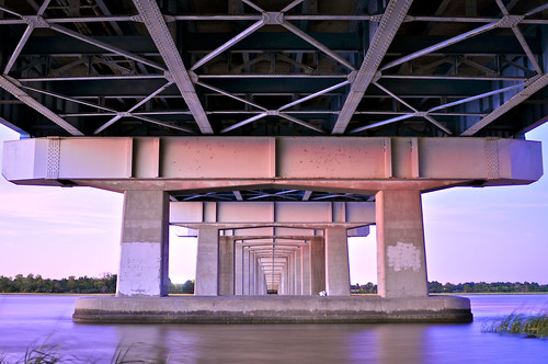
Day 25 - Under the Cosgrove
10 Seconds f/2.8 28mm ISO 200

I really enjoyed writing yesterday’s post. It’s truly a joy for me to talk about the decisions I make when making a photo and also why I choose my favorites from a shoot. I tend to flood my Flickr stream with a ton of different stuff, most of it out of context. Here on my blog I get to put things into a format that explains why I made the shots I did.

I was very pleased to see David duChemin’s blog post today talking about composition. He’s basically reiterating the importance of expression over conforming to the rules of composition. The point I think we both agree on wholeheartedly is that your vision needs to come from within you, not from a set of theories passed off as rules by the general population of some past era in design. Artists like Jean-Michel Basquiat made their statements through their individual and unique expression, not technical prowess.

As I continue to pursue the ideas I get in my head about what specific style I want to define myself with as a photographer, every once in a while I see something very extraordinary that brings out the child-like quality of why most of us ever pick up a camera. A scene screams to you – shoot me!! This was one of those scenes:
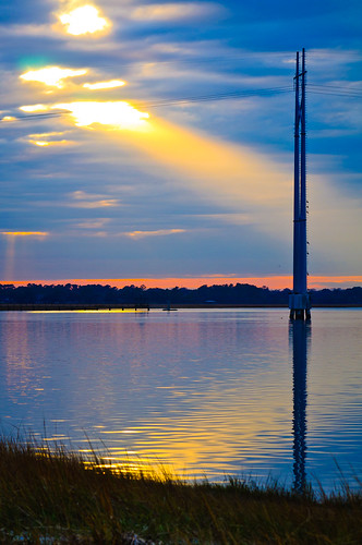
Sunbeam
1/125th of a second F/8 92mm ISO 200

I have a favorite spot I revisit underneath the Cosgrove Bridge in Charleston, SC that a lot of fishermen like to hang out at. Later in the day on New Years Eve I was traveling over this bridge and got giddy when I saw a beam of light peering out from a break in the clouds. It was mystical to say the least. I would have beaten myself up if I didn’t pull the car over and start shooting. After grabbing a few shots I liked, it was gone. I was left with this completely different photo:
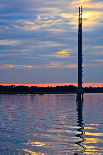
Sunset
1/100th of a second f/12 120mm ISO 200

Now that my main element (the light beam) was no longer in the picture, I was able to look around and explore the effects of the clouds and the light over a scene that’s quite familiar to me. Slightly to the right of the two photos above was this scene:
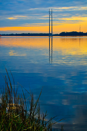
Sunset
1/125th of a second f/8 55mm ISO 200

Notice how the color at the horizon is completely different at this viewpoint and time? I also took advantage of how the clouds were breaking and making triangles at the edge of the scene. While the first two have a horizon that’s nearly in the middle of the shot (some would say that that is a no-no, I say phooey), this one demands a different approach. The mirrored reflection in the water combined with its original elements compliment in a visually balanced way with the grass in the foreground. This was all very intentionally placed in the viewfinder as I composed the image. The secret to successfully composing scenic shots like these for me is to treat each element as a graphical object and place them in a way that they fit for my vision of the scene. My thought process usually begins with a voice in my head telling me, “this looks ‘right'”. After I get a shot like that, I’ll start to expand on it and step out of my head, because that bastard doesn’t know everything and needs to be stood up to every once in a while!

There was something very graphical and cool going on behind me with the clouds, the bridge, and a small pool of water in the foreground. I kept trying to find the best composition and settled on these few elements I just had to include. I started here:
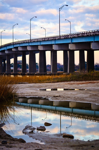
Bridge Reflection
1/125th of a second f/8 85mm ISO 200

I wanted to show a bit more direction with the bridge and include more of the bush. I stayed in the same spot and moved my point of view and focal length slightly to get this:
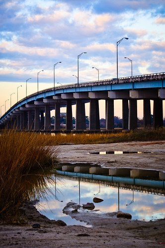
Bridge Reflection
1/125th of a second f/8 68mm ISO 200

I was pretty happy with that last shot. I moved on and started shooting other stuff in the area for a little while. Then, as I was getting back in my car I looked once again at the same scene. Now the color and position of the clouds had gotten so much more vivid that I had to shoot one more shot of this scene. This is how I composed it this time:
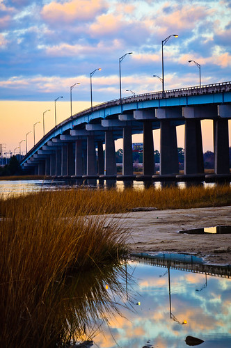
Bridge Reflection
1/125th of a second f/13 92mm ISO 200

I like the last two for different reasons. This last one has a better definition in the clouds and the line of the bridge has a vanishing point that further conveys its direction through the image. I do like the inclusion of the dirt before the pool of water in the first two, but traded it off for that expanded bridge line in the third one. Photography can really be a game of give and take for more reasons than just light values! You see, there were fishermen there and their cars were parked right in my line of sight to the left of the frame. In order to eliminate them, I had to deal with what I had and make it work.

I hope to do a 3rd composition installment in the future involving portraiture, but I’ll need to shoot those shots with publishing the exploratory pics in mind! Thanks for reading. I hope you have a great start to your year. We had a bit of a scare in our house, but it all is seemingly working out now and we’re stronger for overcoming it. “Resistance” has its work cut out for it if it thinks it will hold my family back from its dreams!
Finding Your Composition

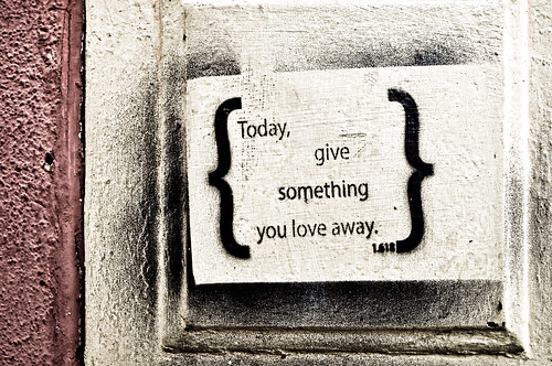
Day 126 - Give It Away
1/200th of a second, f/4.5 22mm ISO 200

When talking about any style of photography, a consistently important factor is composition. If the composition doesn’t connect with the viewer, the picture is overlooked and it fails. When you first become aware of that fact, the issue becomes “How do I change static elements to fit into a better composition?” The answer is usually a simple one – you don’t, you change yourself.

There are plenty of rules that you should know – the rule of thirds, the golden ratio (as featured in the photo above – 1.618), and compositional balance. There’s also the rule of odds, which tells us that three birds is better than two, and the rule of space which suggests that negative space should be used to suggest movement and/or tension. I try to break these rules on a daily basis, but I also try to use them as a reference point. I have not forgotten my own instincts on composition, and combined with the knowledge of the traditional concepts, I find that gives me the opportunity to step out of my own head to explore more possibilities. Lets look at four photos of the same exact scene composed in different ways.

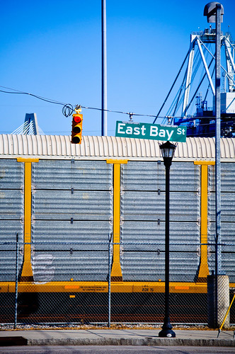
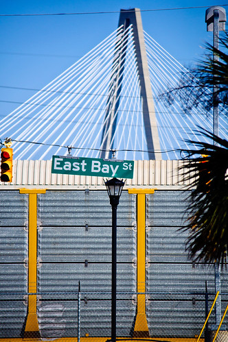
Yesterday I was parked about a block away from a client and decided to do an impromptu photowalk. As I parked, I saw this scene below in my mind just as it’s composed and liked the combination of the shapes of the foreground, middle, and background as a flattened 2D image. I shot the exact scene as I envisioned it.

East Bay Street
1/2500th of a second f/5 180mm ISO 250

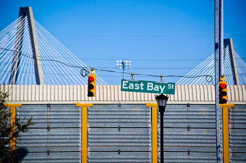
After I got what I wanted, I decided to change the orientation to a landscape shot and used pretty much the same point of view. This brought in some more elements and creates a more recognizable image.

East Bay Street
1/2500th of a second f/5 185mm ISO 200

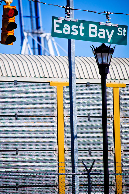
I preferred the vertical composition and tried to re-arrange the elements. This time I moved to the left and zoomed out a bit. I was using my 55-300mm DX lens, which is an awesome and inexpensive piece of glass. I like the composition of the foreground elements (the lamp post, the light, the sign, the sidewalk, and the fence), but I don’t think the background is as powerful with the placement of the crane and the bridge.

East Bay Street
1/2500th of a second f/4.8 116mm ISO 200

Finally, I took a break and shot some other things before I eventually came back to this scene. Sometimes it’s best to gather inspiration by shooting unrelated photos so that when you go back to the first scene, it’s like a whole new vision to behold! This time I got closer. I placed the foreground elements in an evenly spaced way at the top third of the photo and brought out the texture of the fence and train car for the bottom two thirds. The background crane gets blurred and adds a bit of dimension to the shot – this helps more clearly define and separate the foreground, middle and background elements. The gray texture of the train car replaces the sky as a source of a negative space-like element. By moving closer, I also managed to fill the fame. In my opinion, this is the most successful composition of this scene out of the four.

East Bay Street
1/2500th of a second f/5 200mm ISO 200

It’s all the same stuff, I just moved my camera around to include, remove, and alter the view of it. The truth is that there is no correct composition of this scene – It’s all up to you and your tastes. People who view them will have their own reasons for liking different versions, just like some people buy red cars over yellow ones. The power we have as photographers is to define and show what we like in hopes that others will connect with you on it as well. Art is all about relationships. The relationship of the elements on a fundamental and tangible level as well as the relationship of style and intent on a philosophical and spiritual one.

Which one do you like? Why?


Festival of Lights 2010

Charleston Holiday Festival of Lights 2010

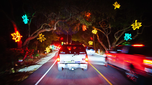
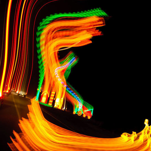
It took two attempts to get in, but we made it to the Charleston Holiday Festival of Lights at James Island County Park this evening. As usual, we listened to classic holiday music while driving though the park checking out the grand light displays. Nothing has changed about it in the six Christmases I’ve spent here in Charleston, but it’s always a fun time with the kids and it really makes the season feel complete.

Charleston Holiday Festival of Lights 2010

Charleston Holiday Festival of Lights 2010

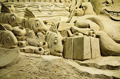
Here’s a piece of the giant sand sculpture for this year, which was an underwater theme.

Charleston Holiday Festival of Lights 2010

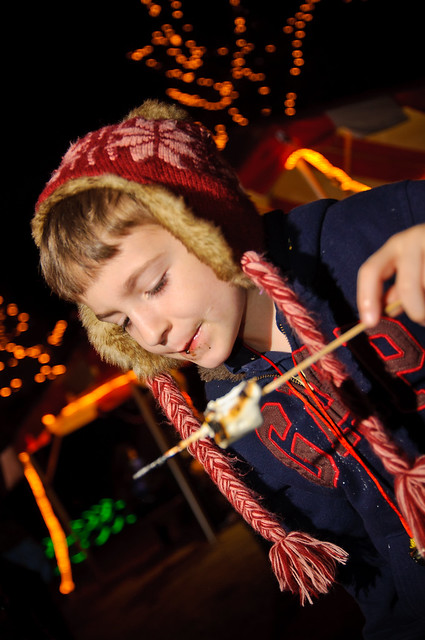
The line to get in earlier this evening was so long that we left and went to my brother-in-law’s home and hung out for an hour or so to wait out the crowd. The second time was a charm and we got to enjoy hot chocolate and roasted marshmallows.

Charleston Holiday Festival of Lights 2010

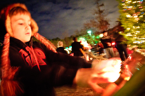
The picture up top was just hand-held with no flash. I have a similar shot here that utilized a wireless flash being held by my daughter, but I lost the whole background with it (and I had it dialed down to 1/100th power). Sometimes the blurry shot captures the feel much better anyway. The second and third shots were taken with the camera held out of the sunroof in our mini-van. The sand sculpture was shot using the railing around the sculpture to steady the camera. The last shot of my son chowing down on a marshmallow was made with a wireless flash held in my left hand pretty much right over the fire pit – I had to be quick on that one!


Painting With Light

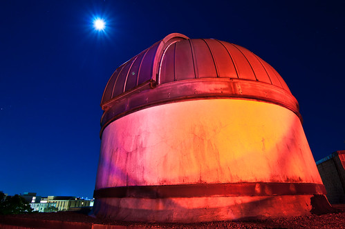
College of Charleston Observatory

As I stated in Friday’s post, I love shooting after the sun goes down. One of the coolest techniques you can use to spruce up your long exposures is called painting with light. Basically, you use a flashlight to paint in the object you are trying to photograph in order to make it stand out in the frame. In the image above, there was a lot of ambient light on the right side of the College of Charleston Observatory dome, so I used my Fenix E01 pocket flashlight to fill in the left side.

Fenix E01

An alternative to the E01 if you have a camera phone with an LED flash such as the iPhone 4, which is just as bright when using one of the countless flashlight apps available. A step up would be something like the Fenix LD15, which is capable of 117 lumens versus the E01’s 10 lumens (Hint to anybody who’s reading).

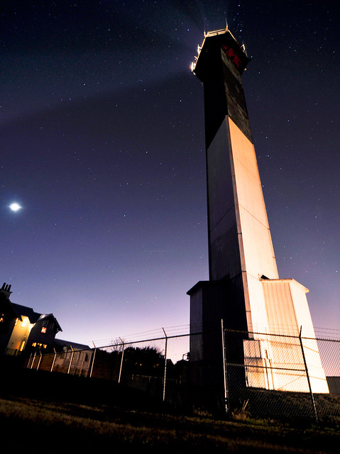
What about a much larger object? A puny pocket flashlight can surprisingly make a huge difference, but sometimes you want to really light up a structure, such as this lighthouse. In this situation, a car was parked on the side of the lighthouse and the owner was kind enough to turn on its headlights to illuminate the whole side of the Sullivan’s Island Lighthouse. Even still, I used my pocket flashlight to fill in some of the lighthouse’s left side.

Day 166 - Sullivan's Island Lighthouse at Night

Photography is all about capturing light, so anything that you can use to manipulate or create it is another item in your mental bag of gear. Whenever I shoot something like the photos above, after I compose the shot and take a test frame, I always think of way to improve it while I’m there. You should rarely ever shoot and think about how you can fix it later. In most situations, post processing should be about maximizing the information that you caught, not about changing it completely. Having a flashlight in you pocket that is just a little bit bigger than a AAA battery is a helpful tool to have for more than finding your keys in the dark!


Industrial Roads

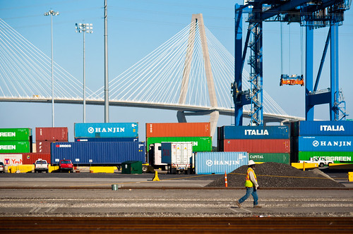
Charleston Docks

In contrast to yesterday’s post, today I snapped a shot of the docks off of East Bay Street in Charleston, SC. I have driven past these docks plenty of times before, and I always wanted to stop and take a shot of them. Today, I decided to practice what I preach and pulled the car over. I walked up and down the street looking for a good shot. I was intentionally trying to frame it to show only a man-made landscape. When the worker walked through the frame, It morphed the whole idea into something new for me.

Look at the grandeur of what we as humans can do. Items such as the shipping containers which see much more of this world geographically than most of the people who create them. Their bold colors, stark texture, and patternless arrangement like giant building blocks line the coast with giant cranes replacing Palmetto trees and a magnificent suspension bridge carving out the skyline like a pair of mountain peaks. In the foreground, instead of grass, lay the train tracks that will eventually cart those boxes to the mainland. Walking through it all is a man. Man, who created this landscape, is strolling through his domain. It’s as if the creator of the world was caught walking through a valley and someone snapped a photo of it.

Every element in your work matters. To me, what started out as a shot to simply show an artificial landscape turned into a nearly spiritual representation of creativity with the addition of one small but meaningful element. It’s the little details that can define a bigger picture.


Privacy Settings
We use cookies to enhance your experience while using our website. If you are using our Services via a browser you can restrict, block or remove cookies through your web browser settings. We also use content and scripts from third parties that may use tracking technologies. You can selectively provide your consent below to allow such third party embeds. For complete information about the cookies we use, data we collect and how we process them, please check our Privacy Policy
Youtube
Consent to display content from - Youtube
Vimeo
Consent to display content from - Vimeo
Google Maps
Consent to display content from - Google