Articles Tagged with: composition

Photo-Tech Update

Charleston

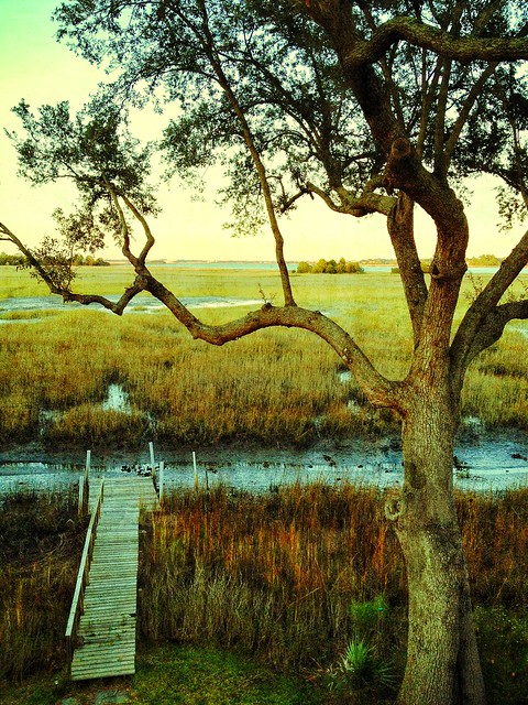
I was recently “forced” into an upgrade of my iPhone to the new 4S model (by forced, I mean I was eligible for upgrade pricing and the home button on my 4 wasn’t working, so I bought a new one). I have to say that I’m floored by the quality of the new iPhone camera. Combined with the amazing photo editing software available on iOS such as Snapseed, you can make truly stunning photos. I’m not saying anything new here, but the newer cell phone cameras have enough resolution where editing photos is far less destructive (at least it’s less noticeable). Photos such as the one above are now at a resolution suitable for printing at a decent size! The dynamic range seems more realistic, and the image stabilization helps combat Mr. Blurrycam (this is especially effective for taking video). I’m very excited about it.
Business End

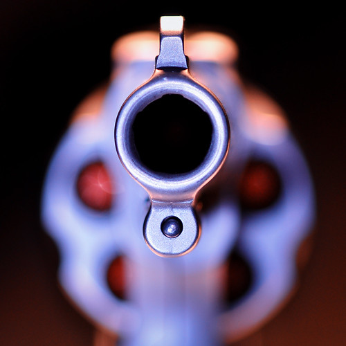
TechCrunch brought this service to my attention. CameraTrace claims to be able to find your lost camera based on an embedded serial number in your EXIF data. The concept is very interesting, but it seems to me the type of person who is stealing photo equipment will not be uploading pictures to Flickr. It’s more likely that the camera will be sold on Craigslist or in a WalMart parking lot to an unassuming poor photographer who will be the one who gets caught with the stolen goods (I know, because I recovered my stolen camera in a WalMart parking lot from a guy who was reselling my D40 on Craigslist that he obtained in a WalMart parking lot). Still, you might get your camera back! The issue I have is that sites like Flickr and 500px are not nearly as popular as Facebook has become for the average person sharing their photos. If they can find a way to search against Facebook photos, then I’d fully support this service. $10 is a pretty small amount to register your camera though, and it will give you an edge in case you do ever fall victim to camera theft.

Christmas 2011

The last thing I wanted to talk about is the Nintendo 3DS and its 3D camera. As far as I know, this is the first widely distributed 3D camera in the world. It’s unfortunate that Nintendo was cheap in the actual camera quality, because the potential is far greater than the reality. Regardless, a 3D still camera is an amazing tool. As photographers, we’ve been forever battling to interpret 3D reality in only two dimensions on film, paper, and/or digital screens. We struggle to find compositional tools to define depth, but with an actual 3D camera, you can see the depth. The cool thing is that it challenges you to exploit that depth, which actually carries over into a 2D conversion of the same photos. By trying to make a better 3D photo, you are actually making a better 2D one as well. I know that sounds crazy, but it makes sense when you really think about it. By trying to isolate and draw the eye to your subject, you instinctively use the techniques that photographers have been practicing for years. From using the rule of thirds to moving closer to finding leading lines, those techniques become second nature when composing in 3D because you are seeing the actual depth! I think the Nintendo 3DS could be a great training tool for teaching composition.
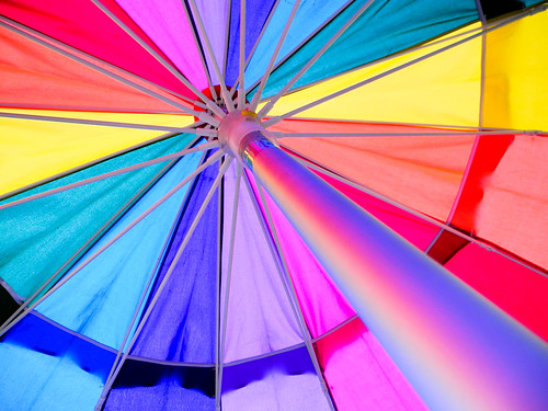
Which One: King Of Pops Umbrella

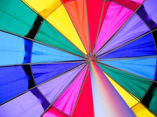
Chase Jarvis has a bit that he does on his blog where he asks his readers to pick from two alternate versions of shots he’s made and explain why you like one over the other. Here’s an example of his latest one. I thought I’d try it out here with two shots taken within seconds of each other. They are also shown in the order they were made in. I shot these with my Nikon Coolpix P7000 at the 2011 Carolina Green Fair this past Sunday in Marion Square. The subject is the iconic King of Pops rainbow umbrella.

Shot #1

Charleston Green Fair 2011

Shot #2

Charleston Green Fair 2011

So which one do you like, shot #1 or shot #2? Why? Sound off here in the comments, or on Facebook, Twitter, or Google+.


Get A Little Closer

Buildings
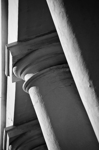
1/2500 sec f/5.0 165mm ISO 200

I took this photo of the columns of a church on Hasell Street the other day in this fashion because the light was really hard. Instead of fighting the light, I decided to get in close to exploit the hard nature of it. By focusing closely in on the lines and contours of the columns, I am able to create a graphically rich and textured photo of one of the more defining elements of a grand old Charleston building.

Sometimes the details of the scene can tell more than a wide literal shot. What is it about the scene that attracts you to it? What naturally draws your eye in the real scene (not the one in the viewfinder)? Try isolating those compelling elements and making a photo about them.

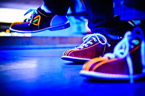
Bowling at AMF West Ashley
0.8 sec f/2.8 40mm ISO 1600

In the scene above, the lights had just dimmed and the black lights came on as “Rock N’ Roll Bowling” started at the AMF West Ashley bowling alley. They must have recently replaced all of their rental shoes, because I immediately noticed everyone’s glowing white laces and trim on their bowling shoes. I put the camera down at foot level and focused on the middle foot. Without showing a ball or pin, most anybody who’s ever been bowling before will recognize exactly what this shot is about.

While you should always move around and find different angles, don’t forget to get in close and fill the frame. A lot of my favorite photos are very simple compositions with only a few major elements. The best way to achieve that is to get in so close that there’s no room for anything else!


Finding Your Composition Part 2

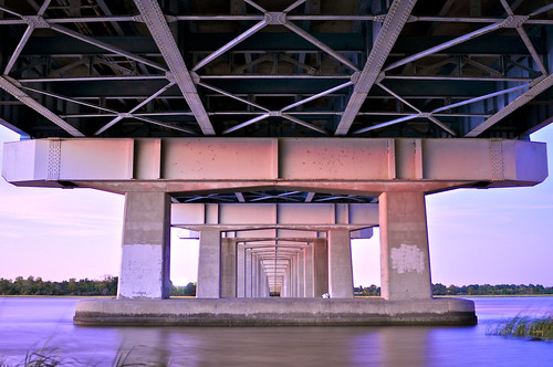
Day 25 - Under the Cosgrove
10 Seconds f/2.8 28mm ISO 200

I really enjoyed writing yesterday’s post. It’s truly a joy for me to talk about the decisions I make when making a photo and also why I choose my favorites from a shoot. I tend to flood my Flickr stream with a ton of different stuff, most of it out of context. Here on my blog I get to put things into a format that explains why I made the shots I did.

I was very pleased to see David duChemin’s blog post today talking about composition. He’s basically reiterating the importance of expression over conforming to the rules of composition. The point I think we both agree on wholeheartedly is that your vision needs to come from within you, not from a set of theories passed off as rules by the general population of some past era in design. Artists like Jean-Michel Basquiat made their statements through their individual and unique expression, not technical prowess.

As I continue to pursue the ideas I get in my head about what specific style I want to define myself with as a photographer, every once in a while I see something very extraordinary that brings out the child-like quality of why most of us ever pick up a camera. A scene screams to you – shoot me!! This was one of those scenes:

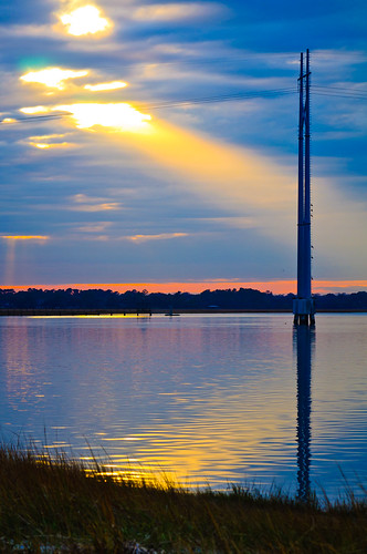
Sunbeam
1/125th of a second F/8 92mm ISO 200

I have a favorite spot I revisit underneath the Cosgrove Bridge in Charleston, SC that a lot of fishermen like to hang out at. Later in the day on New Years Eve I was traveling over this bridge and got giddy when I saw a beam of light peering out from a break in the clouds. It was mystical to say the least. I would have beaten myself up if I didn’t pull the car over and start shooting. After grabbing a few shots I liked, it was gone. I was left with this completely different photo:

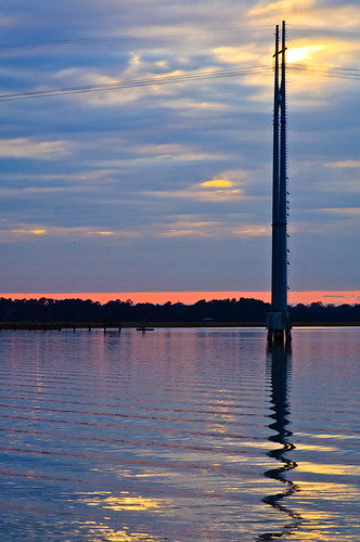
Sunset
1/100th of a second f/12 120mm ISO 200

Now that my main element (the light beam) was no longer in the picture, I was able to look around and explore the effects of the clouds and the light over a scene that’s quite familiar to me. Slightly to the right of the two photos above was this scene:

Sunset
1/125th of a second f/8 55mm ISO 200

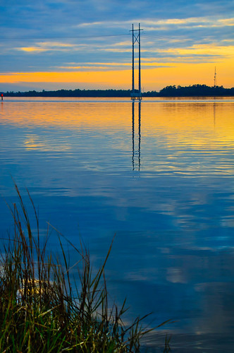
Notice how the color at the horizon is completely different at this viewpoint and time? I also took advantage of how the clouds were breaking and making triangles at the edge of the scene. While the first two have a horizon that’s nearly in the middle of the shot (some would say that that is a no-no, I say phooey), this one demands a different approach. The mirrored reflection in the water combined with its original elements compliment in a visually balanced way with the grass in the foreground. This was all very intentionally placed in the viewfinder as I composed the image. The secret to successfully composing scenic shots like these for me is to treat each element as a graphical object and place them in a way that they fit for my vision of the scene. My thought process usually begins with a voice in my head telling me, “this looks ‘right'”. After I get a shot like that, I’ll start to expand on it and step out of my head, because that bastard doesn’t know everything and needs to be stood up to every once in a while!

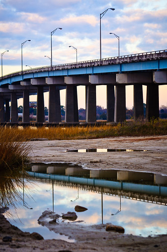
There was something very graphical and cool going on behind me with the clouds, the bridge, and a small pool of water in the foreground. I kept trying to find the best composition and settled on these few elements I just had to include. I started here:

Bridge Reflection
1/125th of a second f/8 85mm ISO 200

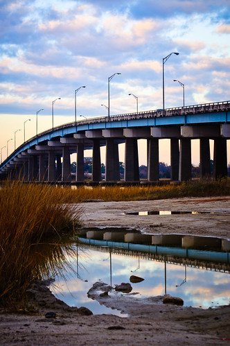
I wanted to show a bit more direction with the bridge and include more of the bush. I stayed in the same spot and moved my point of view and focal length slightly to get this:

Bridge Reflection
1/125th of a second f/8 68mm ISO 200

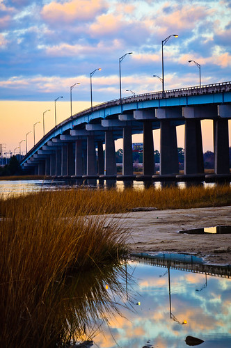
I was pretty happy with that last shot. I moved on and started shooting other stuff in the area for a little while. Then, as I was getting back in my car I looked once again at the same scene. Now the color and position of the clouds had gotten so much more vivid that I had to shoot one more shot of this scene. This is how I composed it this time:

Bridge Reflection
1/125th of a second f/13 92mm ISO 200

I like the last two for different reasons. This last one has a better definition in the clouds and the line of the bridge has a vanishing point that further conveys its direction through the image. I do like the inclusion of the dirt before the pool of water in the first two, but traded it off for that expanded bridge line in the third one. Photography can really be a game of give and take for more reasons than just light values! You see, there were fishermen there and their cars were parked right in my line of sight to the left of the frame. In order to eliminate them, I had to deal with what I had and make it work.

I hope to do a 3rd composition installment in the future involving portraiture, but I’ll need to shoot those shots with publishing the exploratory pics in mind! Thanks for reading. I hope you have a great start to your year. We had a bit of a scare in our house, but it all is seemingly working out now and we’re stronger for overcoming it. “Resistance” has its work cut out for it if it thinks it will hold my family back from its dreams!


Finding Your Composition

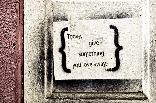
Day 126 - Give It Away
1/200th of a second, f/4.5 22mm ISO 200

When talking about any style of photography, a consistently important factor is composition. If the composition doesn’t connect with the viewer, the picture is overlooked and it fails. When you first become aware of that fact, the issue becomes “How do I change static elements to fit into a better composition?” The answer is usually a simple one – you don’t, you change yourself.

There are plenty of rules that you should know – the rule of thirds, the golden ratio (as featured in the photo above – 1.618), and compositional balance. There’s also the rule of odds, which tells us that three birds is better than two, and the rule of space which suggests that negative space should be used to suggest movement and/or tension. I try to break these rules on a daily basis, but I also try to use them as a reference point. I have not forgotten my own instincts on composition, and combined with the knowledge of the traditional concepts, I find that gives me the opportunity to step out of my own head to explore more possibilities. Lets look at four photos of the same exact scene composed in different ways.

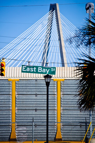
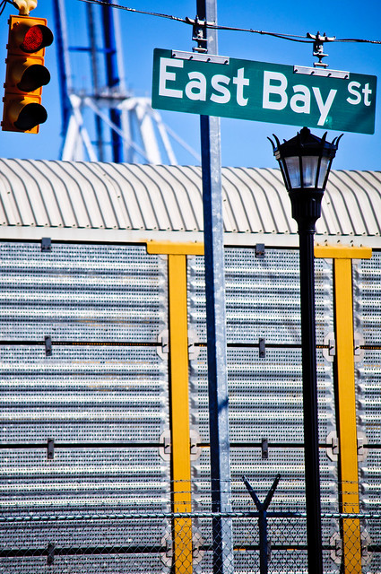
Yesterday I was parked about a block away from a client and decided to do an impromptu photowalk. As I parked, I saw this scene below in my mind just as it’s composed and liked the combination of the shapes of the foreground, middle, and background as a flattened 2D image. I shot the exact scene as I envisioned it.

East Bay Street
1/2500th of a second f/5 180mm ISO 250

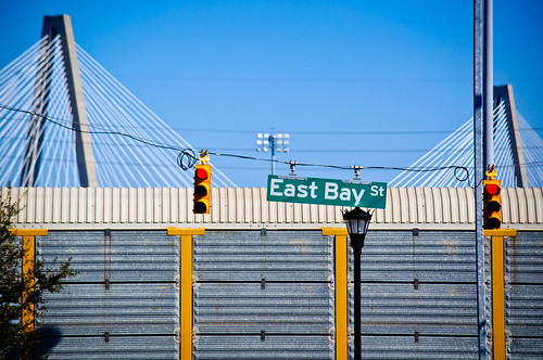
After I got what I wanted, I decided to change the orientation to a landscape shot and used pretty much the same point of view. This brought in some more elements and creates a more recognizable image.

East Bay Street
1/2500th of a second f/5 185mm ISO 200

I preferred the vertical composition and tried to re-arrange the elements. This time I moved to the left and zoomed out a bit. I was using my 55-300mm DX lens, which is an awesome and inexpensive piece of glass. I like the composition of the foreground elements (the lamp post, the light, the sign, the sidewalk, and the fence), but I don’t think the background is as powerful with the placement of the crane and the bridge.

East Bay Street
1/2500th of a second f/4.8 116mm ISO 200

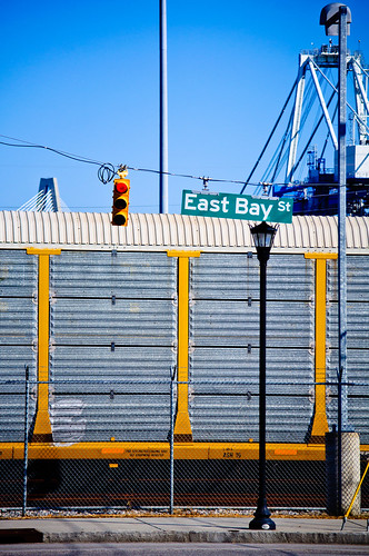
Finally, I took a break and shot some other things before I eventually came back to this scene. Sometimes it’s best to gather inspiration by shooting unrelated photos so that when you go back to the first scene, it’s like a whole new vision to behold! This time I got closer. I placed the foreground elements in an evenly spaced way at the top third of the photo and brought out the texture of the fence and train car for the bottom two thirds. The background crane gets blurred and adds a bit of dimension to the shot – this helps more clearly define and separate the foreground, middle and background elements. The gray texture of the train car replaces the sky as a source of a negative space-like element. By moving closer, I also managed to fill the fame. In my opinion, this is the most successful composition of this scene out of the four.

East Bay Street
1/2500th of a second f/5 200mm ISO 200

It’s all the same stuff, I just moved my camera around to include, remove, and alter the view of it. The truth is that there is no correct composition of this scene – It’s all up to you and your tastes. People who view them will have their own reasons for liking different versions, just like some people buy red cars over yellow ones. The power we have as photographers is to define and show what we like in hopes that others will connect with you on it as well. Art is all about relationships. The relationship of the elements on a fundamental and tangible level as well as the relationship of style and intent on a philosophical and spiritual one.

Which one do you like? Why?


Privacy Settings
We use cookies to enhance your experience while using our website. If you are using our Services via a browser you can restrict, block or remove cookies through your web browser settings. We also use content and scripts from third parties that may use tracking technologies. You can selectively provide your consent below to allow such third party embeds. For complete information about the cookies we use, data we collect and how we process them, please check our Privacy Policy
Youtube
Consent to display content from - Youtube
Vimeo
Consent to display content from - Vimeo
Google Maps
Consent to display content from - Google