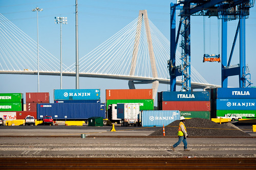
Finding Your Composition
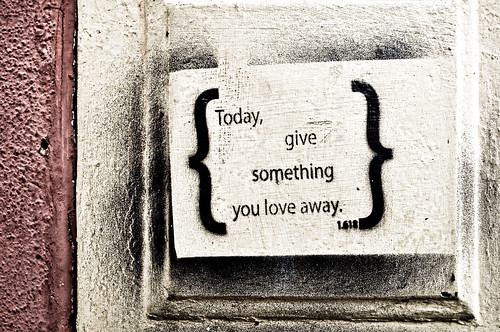
1/200th of a second, f/4.5 22mm ISO 200
When talking about any style of photography, a consistently important factor is composition. If the composition doesn’t connect with the viewer, the picture is overlooked and it fails. When you first become aware of that fact, the issue becomes “How do I change static elements to fit into a better composition?” The answer is usually a simple one – you don’t, you change yourself.
There are plenty of rules that you should know – the rule of thirds, the golden ratio (as featured in the photo above – 1.618), and compositional balance. There’s also the rule of odds, which tells us that three birds is better than two, and the rule of space which suggests that negative space should be used to suggest movement and/or tension. I try to break these rules on a daily basis, but I also try to use them as a reference point. I have not forgotten my own instincts on composition, and combined with the knowledge of the traditional concepts, I find that gives me the opportunity to step out of my own head to explore more possibilities. Lets look at four photos of the same exact scene composed in different ways.
Yesterday I was parked about a block away from a client and decided to do an impromptu photowalk. As I parked, I saw this scene below in my mind just as it’s composed and liked the combination of the shapes of the foreground, middle, and background as a flattened 2D image. I shot the exact scene as I envisioned it.
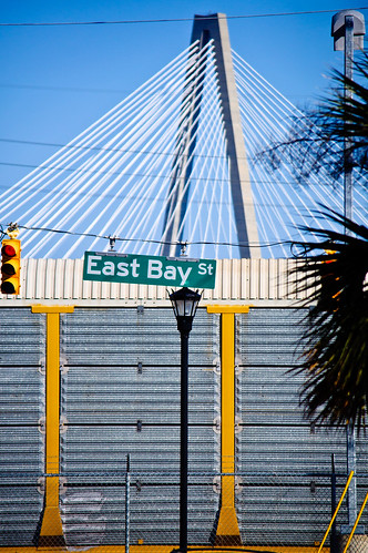
1/2500th of a second f/5 180mm ISO 250
After I got what I wanted, I decided to change the orientation to a landscape shot and used pretty much the same point of view. This brought in some more elements and creates a more recognizable image.
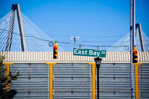
1/2500th of a second f/5 185mm ISO 200
I preferred the vertical composition and tried to re-arrange the elements. This time I moved to the left and zoomed out a bit. I was using my 55-300mm DX lens, which is an awesome and inexpensive piece of glass. I like the composition of the foreground elements (the lamp post, the light, the sign, the sidewalk, and the fence), but I don’t think the background is as powerful with the placement of the crane and the bridge.
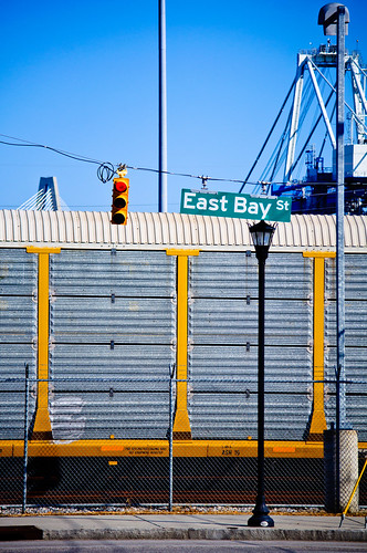
1/2500th of a second f/4.8 116mm ISO 200
Finally, I took a break and shot some other things before I eventually came back to this scene. Sometimes it’s best to gather inspiration by shooting unrelated photos so that when you go back to the first scene, it’s like a whole new vision to behold! This time I got closer. I placed the foreground elements in an evenly spaced way at the top third of the photo and brought out the texture of the fence and train car for the bottom two thirds. The background crane gets blurred and adds a bit of dimension to the shot – this helps more clearly define and separate the foreground, middle and background elements. The gray texture of the train car replaces the sky as a source of a negative space-like element. By moving closer, I also managed to fill the fame. In my opinion, this is the most successful composition of this scene out of the four.
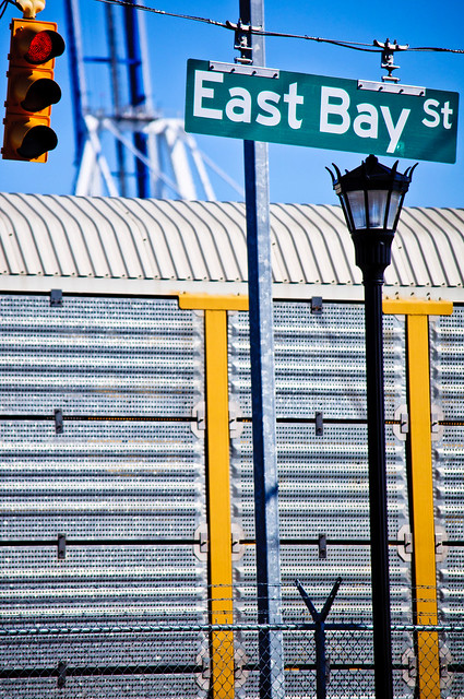
1/2500th of a second f/5 200mm ISO 200
It’s all the same stuff, I just moved my camera around to include, remove, and alter the view of it. The truth is that there is no correct composition of this scene – It’s all up to you and your tastes. People who view them will have their own reasons for liking different versions, just like some people buy red cars over yellow ones. The power we have as photographers is to define and show what we like in hopes that others will connect with you on it as well. Art is all about relationships. The relationship of the elements on a fundamental and tangible level as well as the relationship of style and intent on a philosophical and spiritual one.
Which one do you like? Why?
