Kudos To Miller’s Professional Imaging
I wanted to write a post just to share with you the work that I’m contributing to Kulture Klash 7, but I need to first share with you my account of the great service I received from Miller’s Professional Imaging (who are the people behind Zenfolio/MPIX which is who I use for all of my prints).
I’m quite the busy guy, with a family to support (I’m writing this post as I tend to my daughter who’s home sick from school today) and another business to run. Although I knew that this weekend’s KK7 Arts Festival was this coming up quickly, I failed to note that the artwork drop off date was today (April 5th)! I had ordered my prints over the weekend and when I got a reminder email from the organizers of the festival about the drop off date yesterday, I had a mini panic attack because I wouldn’t have my work ready in time. I quickly sent an email to Zenfolio’s support people and explained my screw-up and asked if I could bump up the shipping to overnight. Not only did they get back to me quickly, they rushed the processing of the prints and upgraded my shipping at no extra cost! I was prepared to pay whatever it takes and they just took care of me at their expense – In my opinion that is simply amazing customer service that goes above and beyond. I’m so proud to have them as my printing partner for JWNPhoto.
The work I’m showing at Kulture Klash was really not what I had originally planned on showing this time around. I had planned on keeping a musical theme with my photos and to have a relationship between them all. When the organizers announced that the theme of the festival for KK7 was going to be water, I threw out my original idea and started thinking about water themed photos. I have a lot of shoreline photos but I didn’t want to come off as kitschy, especially in this festival’s environment which tends to cater to a more underground art scene. Don’t get me wrong, I love a classic sunset photo and I truly love trying to differentiate myself from the crowd while still creating a photo of the same sand, water, and sky. I thought of some of the common traits in my favorite shoreline photos that I’ve created recently – bold color, portrait orientation, & negative space. I remembered that unlike a photo competition – there are no rules to an art show. I could present a triptych of three different images that share a common theme and make an even stronger presentation.
The images at the top of the post are three 20″x30″ prints arranged intentionally in order and placement by the time of day and horizon. The first image was made from the Pitt Street Bridge of the Charleston Peninsula at sunset. I love the crimson color of the sky and the two cranes that look almost like they’re worshiping the falling sun. I remember a seemingly intoxicated lady who walked by while I was making this shot and she commented that the sunset was not very nice. I guess that’s why they say opinions are like asses… everybody has one. The second photo was made at Shem Creek from the bridge. I zoomed in tightly to capture a very golden sky – I love the contrast of the blue shrimping boat and the reflections of the boardwalk lights in the water. This shot also has a diagonal line formed by the dock and boardwalk that is something I tend to look for in a lot of my landscape photos. Finally, the third photo is of the recent Supermoon. I wanted a simple and bold graphical image of the water and the color and shape of the unusually bright moon. It’s very interesting to note that local photographer Robert Donovan (and a host of other local photogs) were all in the same area taking pictures of the same moon, but with very different results. Robert’s image is very similar in composition, but his focus on the detail of the moon made for a completely different image! He’s exposure is very different, so the colors are radically different as well. It just goes to prove that there is a lot of artistic interpretation going on when you get behind the camera and develop the finished product.
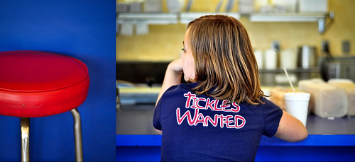
Another piece that I’m showing is this diptych that I made for a Gizmodo.com photo challenge. I wanted to show a picture featuring a person, because I don’t want to be typecast as a landscape photographer. I love the feeling of this photo – The saturation and contrast are very expressive and the Elmo T-Shirt is begging for your eye’s attention, much like the subject’s (my daughter) body language is longing for the attention of the waitress.
I hope to see a lot of friends at the festival this weekend – don’t forget to get your tickets early and save a few bucks!

