Category: Inspiration

Winter Desaturation

Winter Kids
1/250th of a sec | f/5.6 | 300mm | ISO 1600

A popular effect in many casual portraits is the washed-out or desaturated look. Taking cues from high fashion photography, people tend to look more attractive as the facial features get even and blown out while retaining a high contrast with their eyes, clothes, and background elements. The difference is in the deliberate heavy-handed approach – you’re not trying to play a photo trick here, you’re making an obvious change to your photo’s look.
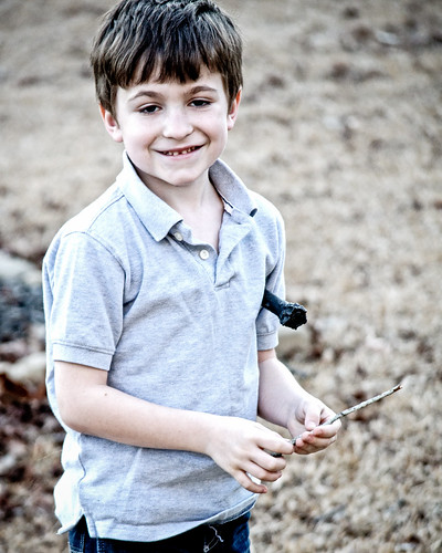
Winter Kids
1/200th of a sec | f/5.0 | 180mm | ISO 1100

This effect works best for me when making outdoor photos, and depending on the feel I’m going for, the color of the sunlight and the time of year determines the best course of action. For a bright sunny day, where the grass is green and the flowers are blooming, it’s best to use directional sunlight in the morning or late afternoon and put the subject between you and the sun. The back-light will give a warm yellow halo effect around your subject (make sure to use spot metering to expose for your subject’s face, because matrix metering will be way off when shooting into the sun).

For winter photos, shooting on an overcast day will naturally give you a cold blue color temperature to match the dead grass and barren trees. In the shots here, I was deliberately going for photos that feel like winter in the south. Sure, the temperature was really warm for January when I took these, but the environment and color still help define these as winter/fall shots. The key here is reign in the yellow grass so that it’s no longer a warm yellow. I started the two shots above using Nik Color Efex Pro’s Bleach Bypass. I made more use of the effect’s local contrast slider more than anything else in the plugin. After I did that, I brought the photo back into Adobe Lightroom and performed some tweaks to maximize the effect as detailed below.

Adobe Lightroom Basic Panel

What if you don’t have Nik Color Efex Pro? You can still get similar results using just the basic tools available in Lightroom or Aperture. This shot of my daughter was created without the use of the Bleach Bypass filter. It is less dramatic, but for her I didn’t particularly like the hardness of the filter.

Winter Kids
1/200th of a sec | f/5.0 | 170mm | ISO 1600

You can see that I needed to be a bit more heavy-handed with my Lightroom basic adjustments without the use of Bleach Bypass:

Adobe Lightroom Basic Panel

In the shot below, I used a different approach which resulted in a much warmer effect because I wanted to have contrast between the pavement and the grass. Although it’s more saturated than the other photos, it still has that grainy high contrast and desaturated feel to it. Another factor that is more of a way of exploiting your lenses shortcomings is to shoot at a high ISO. Depending on the lighting, this can give your shots a graininess that looks quite gritty. I’m pretty sure if I was shooting these with faster glass, I would have chosen to add the grain in later to taste, but since I wasn’t, I chose to take advantage of the high ISO look (and by take advantage, I mean I didn’t have much of a choice).
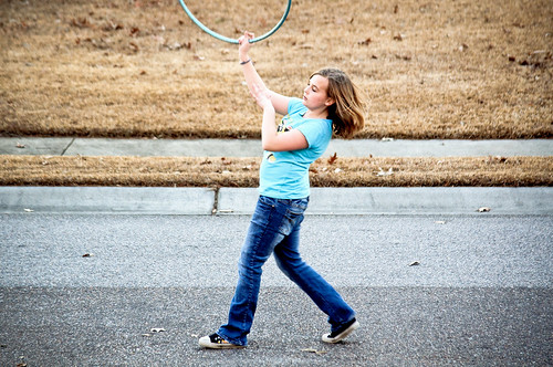
Winter Kids
1/200th of a sec | f/4.8 | 140mm | ISO 800
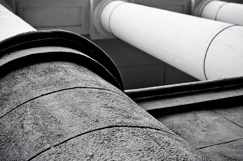

Recalibration

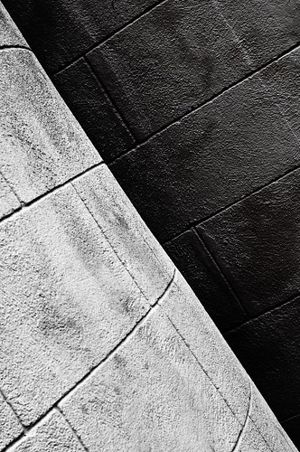
B&W Lines
1/80th of a sec | f/7.1 | 34mm | ISO 200

Like many a tool or machine that you use to get a job done, you creative mind needs to be re-calibrated every once in a while to ensure it’s operating to its full potential. If you feel like your in a slump, or if you’ve taken a break from shooting for awhile, a great way to get back into a groove is to revisit some of the basics.

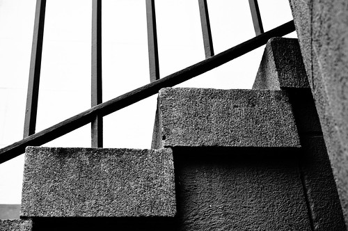
B&W Lines
1/50th of a sec | f/7.1 | 50mm | ISO 200

I’ve been busy with life and haven’t had time to do much creative shooting lately which has been feeling a bit like a rut, so yesterday morning I picked a building that I pass by quite frequently and pulled over to shoot the basics for a few minutes.

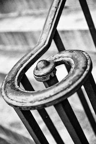
B&W Lines
1/80th of a sec | f/7.1 | 38mm | ISO 200

What were the basics that I was focusing on? Well, the primary theme I set for myself for this set of pictures was lines, and the secondary theme was texture. I concentrated heavily on my composition and moved around to deliberately position the forms of the building in ways that pronounced the direction and conversion of the lines. The best way to define texture in this situation is to search for contrasts – light against dark, straight against curved.

B&W Lines
1/250 of a sec | f/2.8 | 40mm | ISO 200

By getting close and choosing the elements of the photo sparingly, you can find interesting design in most any subject. Once you start to see some of the possible images, the creative juices start to flow and before you know it, you’re shooting in the zone. I believe it’s extremely important to exercise your photographic eyes and to do that, you should properly stretch out by revisiting the basics and re-calibrating yourself.


Insta Vs. Hipsta

Girlie Faces
Made with the Instagram App on the iPhone

Instagram is the latest in mobile phone photography apps that has grown quite popular. The idea is not that new, in fact I don’t really think it’s the best app for creating vintage style photos – I think Hipstamatic does the job fantastically. Instagram does have one thing that it does much better though, and that is the ability to take photos fast and share them quickly.

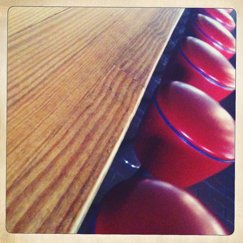
Day 283 - Stools @ Andolini's
Made on the Hipstamatic App on the iPhone

I know, I know… if it’s worth doing, it’s worth taking the time to do it right – But in the world of mobile phone photography, speed and convenience are king. Hipstamtic is a fun app to play around and experiment with, but if you want to catch the moment as it happens and not wait for unreasonable times between each shot, Instamatic will be the app you’ll want to fire up. I personally like to use the iPhone’s built-in camera app and then import the photos into my 3rd party apps – a feature that is unfortunately unavailable with Hipstamatic. I only use Hipstamatic if I have the proper time to set up and take the shot – with it’s selection of lenses and film types (which are available as packs that you have to purchase within the app), you can really make some beautiful photos.

I love these apps because mobile phone cameras are limited by their sensor sizes and resolution, and by exploiting that fact by stylizing the shots you make, you open up creative doors that you might ignore with a traditional camera. On the other hand, in the right situation with the right lighting, you can make some pretty damn amazing images with an iPhone. Over at fstoppers, Lee Morris has an excellent article demonstrating a fashion shoot captured using an iPhone 3Gs. Here’s the video of that shoot:

3M6Y6FAYE8CM


Extremes

Day 324 - Hotter Than Satan's Balls In July
1/1250th of a sec f/4.2 5 mm ISO 150

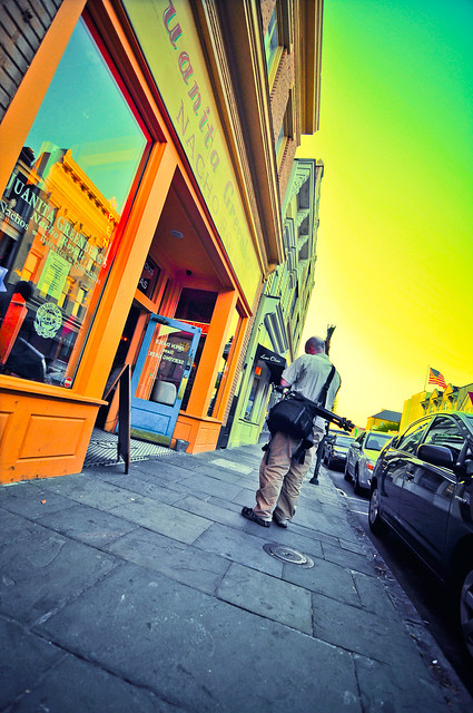
Some of my favorite shots comes from over saturating the photo in post. The effect of over saturation strips a lot of the variation in color & tonality that occurs naturally. It’s a great way to stylishly tackle the harsh light of mid-day, especially in a beach scene like the one above that I took with my waterproof Pentax point-and-shoot camera. At this point, we’re tip-toeing up to the line between photography and digital art, but that is for you to decide as to when it stops becoming photography and starts becoming something else. In my opinion, the elements of the photo are true as well as the composition. A good photograph still captures and defines a moment, and this definitely does that regardless of the treatment I apply to further expand what I envisioned this shot to look like when I made it.

I share this photo now because the sun came out today here in Charleston and the weather was beautifully mild. I felt a longing to be back in the middle of the summer heat while swimming in the Atlantic for hours on end. I took this shot over the past summer and I can’t wait to get back there again. I feel like we’re over that winter hump, and the light of day is going to start hanging around a bit more each day – these are simple things to look forward to, but it’s important to make a conscious effort to appreciate the gifts we are given each day.

Step into the light. So tired of being in the dark and all alone. Step into the light.

A friend of ours held a funeral this evening for her boy that passed away three months into her pregnancy. I can’t help but feel that life is so fragile, and if we don’t say thanks for what we have, we can never truly live nor strive for the most that life can offer. The tragedies in our lives act in contrast to our gifts. Without tragedy, we have nothing to gauge the fantastic things that surround us everywhere and get taken for granted. A man who loses his legs is suddenly aware of how amazing the act of walking is. A child with a loose tooth realizes how fantastic it is to be able to bite into a crisp apple again after the tooth falls out. And a parent that loses a pregnancy is able to love the children she has that much more, because the fact that they are here now is a miracle that gets easily forgotten by most of us during our daily grind.

We’ve started our year with high hopes and have had a very rocky road despite our optimism. I take each struggle as an opportunity to strengthen my resolve to accomplish the goals I have set.
It’s easy to compound the bad shit that happens and then make it worse by belittling the miracles that the negatives in our lives try to overshadow. Being happy isn’t easy when your in the dark, so I’m inviting you to step into the light, no matter how hard that seems.


Street Art On Film

ETTGS-DVD

Tonight I finally got a chance to catch the Banksy film “Exit Through The Gift Shop“. Not since the Wilco film “I Am Trying To Break Your Heart” have I enjoyed a documentary so thoroughly for starting as one interesting topic and then morphing into something completely different and just plain awesome.

Exit Through The Gift Shop seemingly starts out to be about Thierry Guetta, a Frenchman living in LA who runs a thrift shop, and his obsession with filming up-and-coming street artists such as Shepard Fairey and Invader to create his own documentary about them. At one point it is revealed that he’s got boxes and boxes stuffed with raw footage that he never planned to edit. This is where the movie starts to turn into something else – although not sharply. It took the eventual friendship of the famed British street artist Banksy for someone to really call out the Frenchman on his endless journey behind the camera. What happens after that is truly unbelievable. I don’t want to spoil it for those of you like me who have to wait for most movies to come out on Netflix (because the theater is the place I take my kids on the weekends these days) and may not have seen it yet. Go watch it on Netflix – or buy the DVD.

JMBRC-DVD

Another fairly recent documentary that I watched was “Jean-Michel Basquiat The Radiant Child“. This movie is not the comedic thrill ride of Exit Through The Gift Shop. This is more of a tragedy – the rise and fall of one of America’s greatest artists who got his start with street art by spray-painting on buildings with his tag “Samo” and quickly growing his desire to create into a multi-million dollar career. As you may know, this story doesn’t have a happy ending. Don’t worry, I didn’t just spoil the movie for you, the movie is not so much about his life as it is about being a fly on the wall as you watch film maker Tamra Davis’ footage of Basquiat in action. For those of you not familiar with Basquiat’s work, this movie does a great job of helping you get it. For him, it was not about color, texture, or composition. It was all about his vision and voice. His work seems downright child-like to most because he had little-to-no filter to hold him back. The guy was a master in defining just what art could be (not what it was) at the time and who knows if that was really his intention, but it certainly was his work’s effect.

Robert Donovan Check's His White Balance
1/250th of a sec f/2.8 11mm ISO 200

As photographers, we can learn so much from the other art forms. The same themes run though all of the creative processes, and some of the best and brightest stars of each generation are the ones that redefine what we once classified as art. How can photographers take a medium that for all intents and purposes was created to capture that which already exists and create something new? People are doing it every day. The secret is to take your vision of what you see around you and to capture it as you see it – not with your real eyes, but with your mind’s eyes. By drawing the onlooker’s eye to the points you want take them through in a photograph, you can paint the scene with your composition and exposure. By exploiting the shortcomings of cameras you can turn a realistic scene into one with motion, or extreme contrast, or strange colors. By knowing how to properly use the camera, you can make something rather ordinary look extraordinary. I could go on and on, but hopefully you can see why the camera is much more powerful than just a tool to take snapshots of family events. It is our brush, our piano, our pen and paper.

So to wrap this up, can anybody recommend a good film about Keith Haring? I remember going to see a show of his work when I was a kid and his work has really stuck with me since then.


Street Photography

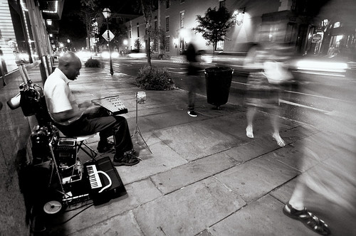
Day 273 - Xylophone Man On Meeting & Market
0.4 sec f/2.8 11mm ISO 200

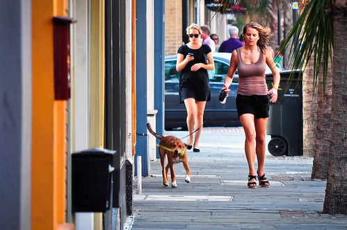
One of my favorite forms of photography to create is street photography. I remember showing the shot of the girl doing yoga that is featured at the top of this website (or by clicking here) to someone and they thought that it was weird that I was at the beach just taking shots of random people I didn’t know. I explained that that is the beauty of it – you are capturing real life, not posed life. Once people are aware you are photographing them out in public, they change. Sometimes that change ruins the shot.

I bring this up today because I was turned on yesterday by a post on Chase Jarvis’ blog to a very well known street photographer named Scott Schuman who runs the popular blog “The Sartorialist“. If you have a few minutes, watch the video that Chase shared (just under this paragraph) – it’s very inspirational – it will hopefully make you get why he does what he does.

It also reminded me of the legendary photographer Jay Maisel, who after retiring from doing commercial assignments in the 90’s, focused on street photography as well as teaching and selling fine art prints of his work. If you have a Kelby Training account, there is a fantastic series featuring Scott Kelby and Jay doing a photowalk through New York City. Guys like Jay Maisel and Scott Schuman both stress the importance of exorcising your creative mind, and they do it while approaching strangers so confidently that it’s tough not to be inspired by their skill.

King Street
1/60th of a sec f/5.6 200mm ISO 200

One of the things I’ve been known for here in Charleston, SC is my photographs of local scenes and events. I’ve been inspired to add a new “Street Photography” category to my blog to start sharing some of those posts in one organized place. It’s a way for me to have a place to talk about my life experiences when I choose to bring the camera along with me (which is most of the time). I’ve also added an “Insight” category, which is similar to the “Inspiration” category but focuses more on my soapbox type posts about technique, gear, or business, where the inspiration category is about things, people, or events that inspire me. Finally, I added a sub-menu at the top menu of the blog to quickly access these categories so you can browse the blog posts by whatever topic you’re in the mood to read about.

Have a great 1.11.11 – I’ll be more excited for 11.11.11 though 😉


Get A Little Closer

Buildings
1/2500 sec f/5.0 165mm ISO 200

I took this photo of the columns of a church on Hasell Street the other day in this fashion because the light was really hard. Instead of fighting the light, I decided to get in close to exploit the hard nature of it. By focusing closely in on the lines and contours of the columns, I am able to create a graphically rich and textured photo of one of the more defining elements of a grand old Charleston building.

Sometimes the details of the scene can tell more than a wide literal shot. What is it about the scene that attracts you to it? What naturally draws your eye in the real scene (not the one in the viewfinder)? Try isolating those compelling elements and making a photo about them.

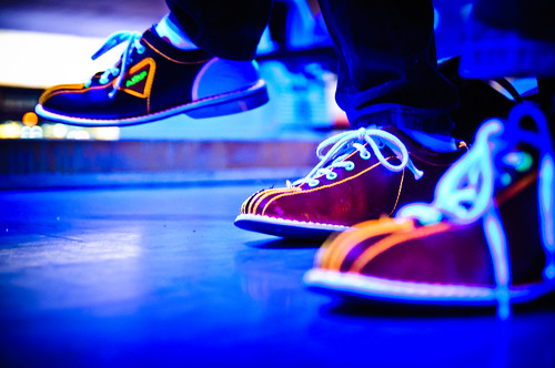
Bowling at AMF West Ashley
0.8 sec f/2.8 40mm ISO 1600

In the scene above, the lights had just dimmed and the black lights came on as “Rock N’ Roll Bowling” started at the AMF West Ashley bowling alley. They must have recently replaced all of their rental shoes, because I immediately noticed everyone’s glowing white laces and trim on their bowling shoes. I put the camera down at foot level and focused on the middle foot. Without showing a ball or pin, most anybody who’s ever been bowling before will recognize exactly what this shot is about.

While you should always move around and find different angles, don’t forget to get in close and fill the frame. A lot of my favorite photos are very simple compositions with only a few major elements. The best way to achieve that is to get in so close that there’s no room for anything else!


Finding Your Composition Part 2

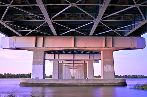
Day 25 - Under the Cosgrove
10 Seconds f/2.8 28mm ISO 200

I really enjoyed writing yesterday’s post. It’s truly a joy for me to talk about the decisions I make when making a photo and also why I choose my favorites from a shoot. I tend to flood my Flickr stream with a ton of different stuff, most of it out of context. Here on my blog I get to put things into a format that explains why I made the shots I did.

I was very pleased to see David duChemin’s blog post today talking about composition. He’s basically reiterating the importance of expression over conforming to the rules of composition. The point I think we both agree on wholeheartedly is that your vision needs to come from within you, not from a set of theories passed off as rules by the general population of some past era in design. Artists like Jean-Michel Basquiat made their statements through their individual and unique expression, not technical prowess.

As I continue to pursue the ideas I get in my head about what specific style I want to define myself with as a photographer, every once in a while I see something very extraordinary that brings out the child-like quality of why most of us ever pick up a camera. A scene screams to you – shoot me!! This was one of those scenes:

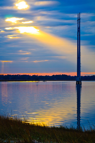
Sunbeam
1/125th of a second F/8 92mm ISO 200

I have a favorite spot I revisit underneath the Cosgrove Bridge in Charleston, SC that a lot of fishermen like to hang out at. Later in the day on New Years Eve I was traveling over this bridge and got giddy when I saw a beam of light peering out from a break in the clouds. It was mystical to say the least. I would have beaten myself up if I didn’t pull the car over and start shooting. After grabbing a few shots I liked, it was gone. I was left with this completely different photo:

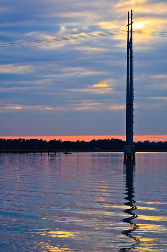
Sunset
1/100th of a second f/12 120mm ISO 200

Now that my main element (the light beam) was no longer in the picture, I was able to look around and explore the effects of the clouds and the light over a scene that’s quite familiar to me. Slightly to the right of the two photos above was this scene:

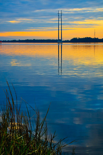
Sunset
1/125th of a second f/8 55mm ISO 200

Notice how the color at the horizon is completely different at this viewpoint and time? I also took advantage of how the clouds were breaking and making triangles at the edge of the scene. While the first two have a horizon that’s nearly in the middle of the shot (some would say that that is a no-no, I say phooey), this one demands a different approach. The mirrored reflection in the water combined with its original elements compliment in a visually balanced way with the grass in the foreground. This was all very intentionally placed in the viewfinder as I composed the image. The secret to successfully composing scenic shots like these for me is to treat each element as a graphical object and place them in a way that they fit for my vision of the scene. My thought process usually begins with a voice in my head telling me, “this looks ‘right'”. After I get a shot like that, I’ll start to expand on it and step out of my head, because that bastard doesn’t know everything and needs to be stood up to every once in a while!

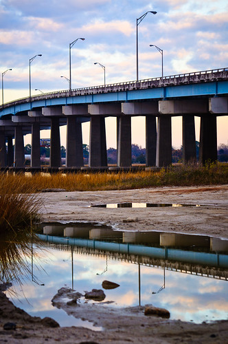
There was something very graphical and cool going on behind me with the clouds, the bridge, and a small pool of water in the foreground. I kept trying to find the best composition and settled on these few elements I just had to include. I started here:

Bridge Reflection
1/125th of a second f/8 85mm ISO 200

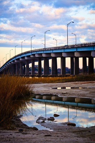
I wanted to show a bit more direction with the bridge and include more of the bush. I stayed in the same spot and moved my point of view and focal length slightly to get this:

Bridge Reflection
1/125th of a second f/8 68mm ISO 200

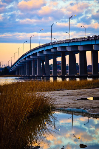
I was pretty happy with that last shot. I moved on and started shooting other stuff in the area for a little while. Then, as I was getting back in my car I looked once again at the same scene. Now the color and position of the clouds had gotten so much more vivid that I had to shoot one more shot of this scene. This is how I composed it this time:

Bridge Reflection
1/125th of a second f/13 92mm ISO 200

I like the last two for different reasons. This last one has a better definition in the clouds and the line of the bridge has a vanishing point that further conveys its direction through the image. I do like the inclusion of the dirt before the pool of water in the first two, but traded it off for that expanded bridge line in the third one. Photography can really be a game of give and take for more reasons than just light values! You see, there were fishermen there and their cars were parked right in my line of sight to the left of the frame. In order to eliminate them, I had to deal with what I had and make it work.

I hope to do a 3rd composition installment in the future involving portraiture, but I’ll need to shoot those shots with publishing the exploratory pics in mind! Thanks for reading. I hope you have a great start to your year. We had a bit of a scare in our house, but it all is seemingly working out now and we’re stronger for overcoming it. “Resistance” has its work cut out for it if it thinks it will hold my family back from its dreams!


Finding Your Composition

Day 126 - Give It Away
1/200th of a second, f/4.5 22mm ISO 200

When talking about any style of photography, a consistently important factor is composition. If the composition doesn’t connect with the viewer, the picture is overlooked and it fails. When you first become aware of that fact, the issue becomes “How do I change static elements to fit into a better composition?” The answer is usually a simple one – you don’t, you change yourself.

There are plenty of rules that you should know – the rule of thirds, the golden ratio (as featured in the photo above – 1.618), and compositional balance. There’s also the rule of odds, which tells us that three birds is better than two, and the rule of space which suggests that negative space should be used to suggest movement and/or tension. I try to break these rules on a daily basis, but I also try to use them as a reference point. I have not forgotten my own instincts on composition, and combined with the knowledge of the traditional concepts, I find that gives me the opportunity to step out of my own head to explore more possibilities. Lets look at four photos of the same exact scene composed in different ways.

Yesterday I was parked about a block away from a client and decided to do an impromptu photowalk. As I parked, I saw this scene below in my mind just as it’s composed and liked the combination of the shapes of the foreground, middle, and background as a flattened 2D image. I shot the exact scene as I envisioned it.

East Bay Street
1/2500th of a second f/5 180mm ISO 250

After I got what I wanted, I decided to change the orientation to a landscape shot and used pretty much the same point of view. This brought in some more elements and creates a more recognizable image.

East Bay Street
1/2500th of a second f/5 185mm ISO 200

I preferred the vertical composition and tried to re-arrange the elements. This time I moved to the left and zoomed out a bit. I was using my 55-300mm DX lens, which is an awesome and inexpensive piece of glass. I like the composition of the foreground elements (the lamp post, the light, the sign, the sidewalk, and the fence), but I don’t think the background is as powerful with the placement of the crane and the bridge.

East Bay Street
1/2500th of a second f/4.8 116mm ISO 200

Finally, I took a break and shot some other things before I eventually came back to this scene. Sometimes it’s best to gather inspiration by shooting unrelated photos so that when you go back to the first scene, it’s like a whole new vision to behold! This time I got closer. I placed the foreground elements in an evenly spaced way at the top third of the photo and brought out the texture of the fence and train car for the bottom two thirds. The background crane gets blurred and adds a bit of dimension to the shot – this helps more clearly define and separate the foreground, middle and background elements. The gray texture of the train car replaces the sky as a source of a negative space-like element. By moving closer, I also managed to fill the fame. In my opinion, this is the most successful composition of this scene out of the four.

East Bay Street
1/2500th of a second f/5 200mm ISO 200

It’s all the same stuff, I just moved my camera around to include, remove, and alter the view of it. The truth is that there is no correct composition of this scene – It’s all up to you and your tastes. People who view them will have their own reasons for liking different versions, just like some people buy red cars over yellow ones. The power we have as photographers is to define and show what we like in hopes that others will connect with you on it as well. Art is all about relationships. The relationship of the elements on a fundamental and tangible level as well as the relationship of style and intent on a philosophical and spiritual one.

Which one do you like? Why?


What’s In A Name?

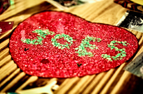
Joe's Heart

Taken at Joe’s Crabshack in Myrtle Beach, SC. 35mm, 1/10 of a sec, f/1.8, ISO 200

As I go about my research and plans to formulate my photography career (which, by the way, I’m including y’all each step of the way because I don’t know if something like this has been done before and I think it would be cool to follow someone like myself on this journey), I’m reading a book by photog/writer Dane Sanders called, “Fast Track Photographer“. The book is full of self exploration exorcises to try and determine the type of photography business you should run. This is the hardest part about getting started when you decide to go professional. As Dane states, it’s not a good idea to be an all-around generic photographer in today’s market of saturated photographers because anybody (and seemingly everybody) can get a nice camera and take decent photos. The idea is to find a niche that captures your essence and creates value by doing something that is unique to you. You need to be something that nobody else can be and nobody can be you. It boils down to determining what it is that you are good at, what you love, what makes you you, and marrying those ideas into a brand that you can market yourself as.

Some of this I had already started doing before I even began reading this book. In this article I defined what I’m currently a fan of doing in photography. It is important because given my background as a professional musician who was signed to a recording contract and toured the world years ago, I do have a rather unique insight into the performance world. I also have an obsession with reaching the creative zone and would love to capture people in that zone. To me that would be the decisive moment I’m after in these types of shots. It’s not just music either – I want to capture the moment when people are acting on pure instinct. It could be anything from a guy working on a telephone pole to a dancer practicing alone in a studio. We all have things we do and we do them so well that we get lost in them. That’s the zone I’m interested in. Now that I’ve gotten off on a tangent, let’s get back to the point I wanted to make at the start of this.

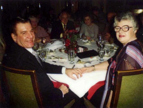
Grandpa & Grandma

My grandparents from back in the day – photographer unkown

One of the things that Mr. Sanders brushes on in his tips for branding your photography business is your name. He uses the beautiful Jasmine Star as an example. She uses her middle name instead of her last name because it just works perfectly for her. When I was deciding on what to call my website a few months ago, I made a very conscious decision to avoid my own last name because “Nienstedt” is just a pain in the ass to explain how to spell to people. I also toyed with the idea of using my own middle name which is Walter, named from my beloved grandfather who raised me. I would be Joseph Walter – photographer of [insert type of photography here]. The more I thought of how nice it would be to drop my Germanic last name, the more I realized that I shouldn’t do it.

Why continue to suffer with a complicated name to spell and pronounce when I have the opportunity to make my life easier? It’s who I am. I came into this world as Joseph Walter Nienstedt and I should be able to succeed regardless of my currently un-marketable name. In fact, in an effort to define my uniqueness, what better way to start than using my real name? So I would like to thank Dane Sanders for the suggestion, but I think his overall theme of defining yourself works in spite of doing what is conventionally accepted or expected by the marketeers of the world. I’d love to know what you think of my decision and the general practice of making your name easier for the general public to consume. Let it be known that I do like nicknames because I find those endearing since we rarely choose them ourselves, they are (hopefully) given to us by loved ones.


Privacy Settings
We use cookies to enhance your experience while using our website. If you are using our Services via a browser you can restrict, block or remove cookies through your web browser settings. We also use content and scripts from third parties that may use tracking technologies. You can selectively provide your consent below to allow such third party embeds. For complete information about the cookies we use, data we collect and how we process them, please check our Privacy Policy
Youtube
Consent to display content from - Youtube
Vimeo
Consent to display content from - Vimeo
Google Maps
Consent to display content from - Google