Monthly Archives: February 2011

More Than One Way

robo-rainbow from mudlevel on Vimeo.

I saw this video this morning (via engadget.com) and thought it was really interesting. As I read through the comments on Engadget, there was one troll on there who was complaining about the uselessness and inefficiency of the machine. I had to chime in and “feed the troll” as they say because it’s apparent that some people don’t see something like this for what it really is. There’s always more than one way to interpret art, and for something like this, the end result is not the whole point of the piece.
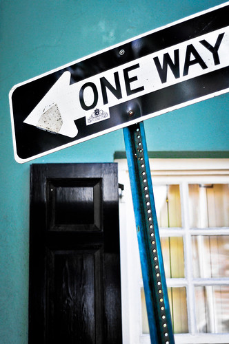
One Way

As you watch the video, which was carefully filmed and edited together, you see a man assembling a machine attached to a bicycle. You get close up shots of the metal work, the fitting of the electronics, and the movement of the gears and chains. Each shot isolates a feature and is dramatically demonstrated until we see it all in action – which is shown with a wide shot of it painting a rainbow on a wall. Now, to someone who’s not paying attention, the art was in creating the machine and the filming of the assembly of it. The rainbow itself was just a mere punchline to a well setup joke. If this was about painting a perfectly symmetrical rainbow, then it would be nutty. There are plenty of ways to paint a rainbow without going through the effort that was put into this.

The art is in the creation of it all. The steampunkish contraption itself, the storytelling in the filming, and the final execution all work together. It’s the act of creating something because you can. The message I took from this was that the journey is always more important than the destination. What’s your interpretation?
Musical Composition

Sherwin Sleeves (AKA Sean Hurley) is a strange cat. I don’t know if it’s the weather in New Hampshire or what, but I dig his originality nonetheless. He has gained some popularity as a regular contributor to the Ron & Fez show on XM radio, which is how I found out about him. I think my interest in his craft was gained not just by his rather odd musical interpretations of the happenings of a radio comedy show, but by the videos he’s posted and words he’s written. He is a fine pianist who can write music seemingly effortlessly. He’s a master of his art.

If you have a few minutes, watch the video above. The character of Sherwin Sleeves is a bit over the top, but I think it works. If you apply a lot of his concepts about musical composition to the art of photography, you will find that the creative process is very similar. I have been beating the drum about the correlation between music and photography since I started this blog in September, in fact my first real post here was entitled “Music & The Zone“.


Pseudo HDR

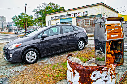
New Car, Old Charleston
1/1000th of a sec | f/6.3 | 17mm | ISO 1600

Some photos just scream to be in High Dynamic Range, but sometimes you don’t have your tripod with you, or you took the shot and later realized you want it to be in HDR. That’s OK, there are quite a few ways to get the effect of an HDR image without using multiple exposures. I used to take an image and then save 3 different versions of the photo as tiffs – one correct exposure, one I pushed the brightness up to overexpose it and another that I pushed down to underexpose. I would then recombine those in Photomatix to create an HDR image – it works pretty well, but it’s a lot of work.

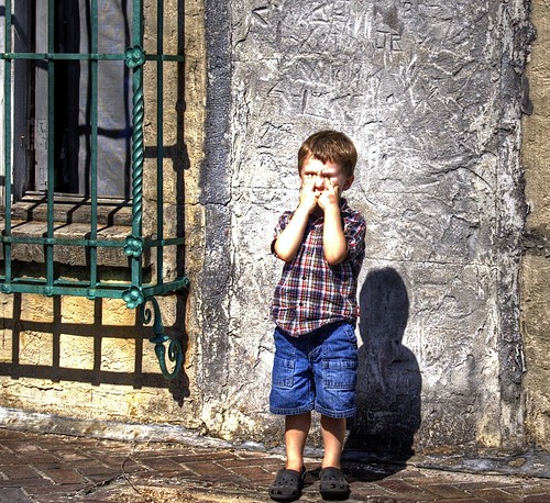
Here is an example of an image I made using that method:

Kegan Shuts His Eyes

I’ve since found a more efficient way to get the effect and it takes a fraction of the time. I use Nik Color Efex Pro’s Tonal Contrast filter. By running the photo through this plugin first, I’m able to push the dynamic range of the photo by manipulating contrast highlights, midtones, and shadows. The HDR look is really pronounced by pushing the midtone contrast way ahead of the others. Here’s a screenshot of the Tonal Contrast filter settings for the photo up at the top of this post (click it to enlarge):

Nik Efex Pro 3 Tonal Contrast

I also pushed the saturation, because I like my HDR photos to be over-saturated. In doing so, it made the color of the car a purplish-blue tint. It is actually a dark gray, so when I brought the photo back into Adobe Lightroom, I used the saturation selector tool in the HSL panel to select the car and drop down the saturation. While I was there I also pushed the other colors up even more. Here’s what the settings looked like:

Adobe Lightroom HSL saturation panel

I also made some pretty strong adjustments in the basic panel of Lightroom. I pushed the saturation once more and also heavily applied the clarity slider, which can also be used to enhance the dynamic range of a photo. Here’s what those settings look like:

Adobe Lightroom Basic Panel

So, there you go – the end result looks very much like a traditional HDR photo. One last pointer is to make sure you have your aperture set to a small size (larger f number) so that more of the picture is in focus. HDR usually looks like crap on a photo that is exploiting a very shallow depth of field – the bokeh gets real funky and the effect just looks weird.

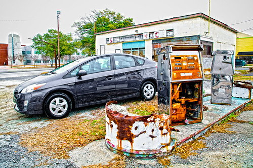
Here’s an alternate angle of the shot in the example above:

New Car, Old Charleston
1/250th of a sec | f/6.3 | 17mm | ISO 720


Privacy Settings
We use cookies to enhance your experience while using our website. If you are using our Services via a browser you can restrict, block or remove cookies through your web browser settings. We also use content and scripts from third parties that may use tracking technologies. You can selectively provide your consent below to allow such third party embeds. For complete information about the cookies we use, data we collect and how we process them, please check our Privacy Policy
Youtube
Consent to display content from - Youtube
Vimeo
Consent to display content from - Vimeo
Google Maps
Consent to display content from - Google